Hello, today i'll introduce about
simple but powerful visualize Gen tool.
 source_napkin.ai homepage

Instead of explaining it in words, let's do it ourselves
Let's get start.
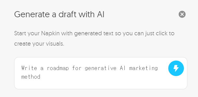
First, choose category of your report.

Then it generates approximate content.
Of course, it is much more effective to upload and utilize existing files.
Main point is right below.
Visualize your text info.

The contents can be visualized in tables, images, etc. for each paragraph or sentence.
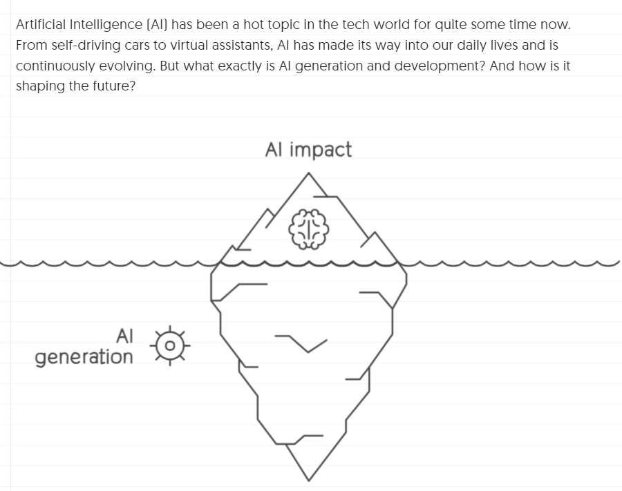
Circular pie graphs are also one of the valid options
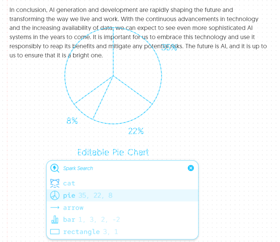
Or like this...
Then how about Roadmap category?
Select your topic,
Then it will generate valid content.

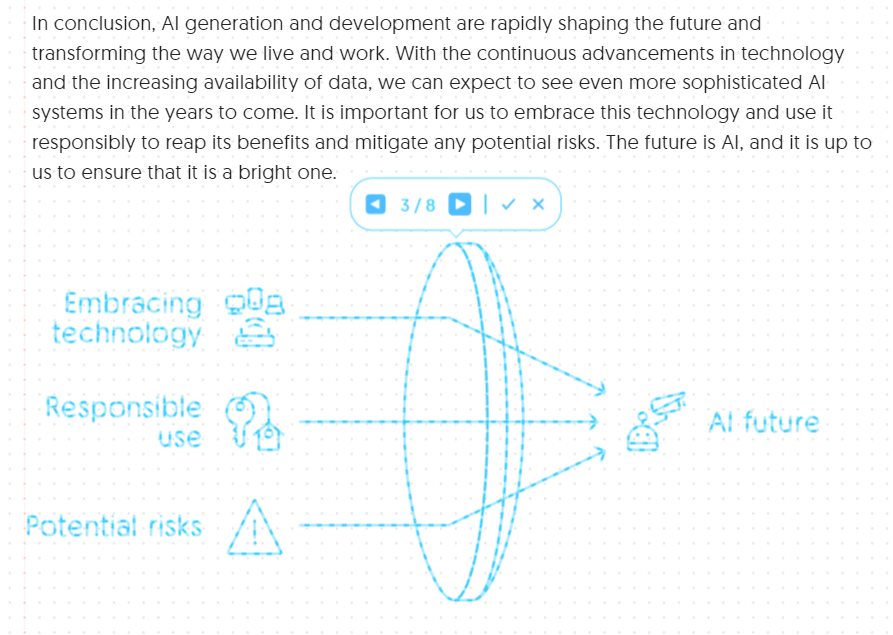
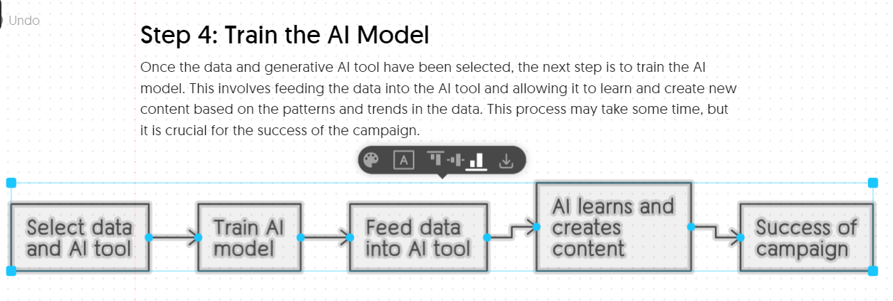
A step-by-step graph is also a great aid to help you
In fact, the more intuitive the Generative AI service is,
the more I recommend you try it yourself.
So why don't you visualize your work once?
Thanks.